Once the reaction scheme components are all present and marked up, the last step in this toolchain is to propose a coarse-grained set of conditions, namely the duration, temperature and catalyst concentration that is likely to provide the best yield.
This is a series of articles about reaction prediction. The summary overview and table of contents can be found here. The website that provides this functionality is currently in a closed beta, but if you are interested in trying it out, just send an email to alex.clark@hey.com and introduce yourself.
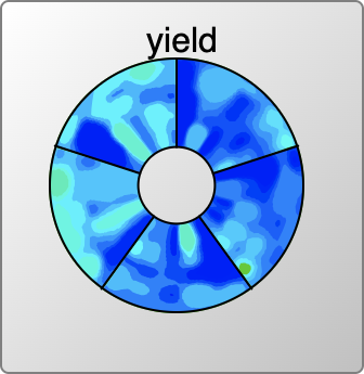
Anyone who has been reading along with this series might have already wondered about the colourful disc that appears in some of the snapshots. That is the topic of this article.
The scalar reaction conditions (duration, temperature, catalyst concentration) have entered into the models previously, as they are used to compose the ranking scores for catalysts and solvents. Once all of the components of the scheme have been provided (reactants, reagents, catalysts, solvents, adjuncts, products and byproducts) and mapped and balanced, the question can then be posed: what values for heat/time/concentration maximise the yield?
The method of choice for assembling the model is to feed in all of the component information in the form of labelled graphs (as for all the other deep learning models described in this series) along with a vector representation for the heat/time/concentration numbers. The output variable being modelled is yield.
Application of the model is done by (a) presupposing the components are all present, and (b) creating a sampling grid the scalar parameters. If there’s no catalyst, the grid is 2D (heat & time). If there is a catalyst, it’s a 3D grid (heat, time & concentration). Plotting these grid points can be used to interpolate intermediate values and produce a contour.
This is one of the most recently implemented features in the overall toolset, even though I came up with the idea some time ago, and even implemented the model network. It got put on the shelf for awhile because the training process refused to converge on anything significantly above random noise. After some effort to stomp out bugs, I tentatively concluded that it was probably because my training data was just too sparse – and that the bias toward catalyst method papers rather than a generic tour through common organic chemistry was not doing me any favours.
Fast forward a year or so, having added a fair bit more training data of the more banal variety, I re-ran the model building routine, and was pleasantly surprised to find it producing a good correlation. I’m working with the hypothesis that the density of training data passed some kind of threshold from too sparse to be useful to just barely dense enough.
Armed with a model producing favourable metrics, the next big challenge is visualisation. For the 2D case (no catalyst): select reasonable grid points for duration and temperature, where time is plotted on a log scale, while temperature needs to be contained between the melting and boiling point(s) of the solvents (i.e. telling someone to run a reaction in diethyl ether at 100°C is rather bad advice, and likewise -78°C in water is probably not great either).
Creating a grid of, say, 10 x 10 points is something that can be done at reasonable computational cost: composing the datastructures for the graphs that go into the network can be done just once for each calculation, while the vectors for the heat & time parameters are varied for each grid point. It does still require a fair few matrix calculations, so grid size does impact total computational cost. The results of this grid calculation are sent back to the client, which then applies polynomial interpolation to make the grid somewhat denser, at much lower cost.
Each point on the grid implies a value for heat & time, and has a response of yield (0..100). The yield values are then thresholded into some number of levels (e.g. 10), and each of these levels has its own grid mask (with the lower cutoffs having much larger participation). Some correction can be done on these grid masks, e.g. isolated or surrounded points can be flipped. Each of the grid mask levels are subjected to Delaunay triangulation, and the island regions are detected as outlines: each of these is then converted into a polygon, which is then smoothed into a splined path.
Each layer is now composed of a collection of closed paths, and these are plotted onscreen in order of lowest thresholds first. The result looks like this:


The 2D plot is interactive: moving the cursor over a position will report on the heat & time that corresponds to the position, and the predicted/interpolated yield for that position. Double clicking on the point will cause the interface to fill in the scheme with the corresponding values, including the anticipated yield.
Rendering for reactions with catalysts could be done with a 3D plot (heat/time/concentration), but invoking 3D is often somewhat unwieldy, and not necessarily the best way to communicate information. The grid sampling points for catalyst concentrations are done in log units (10%, 1%, 0.1% etc.) so it makes sense to consider plotting these entirely separately. The view that is used is something that looks like a colourful compact disc (if you weren’t musically active in the ’90s, don’t worry about it) divided up into several segments, one for each catalyst concentration. Within the truncated wedge, the heat/time plot is extant, and so it is possible to see at a glance where the promising hotspots are for all concentrations.
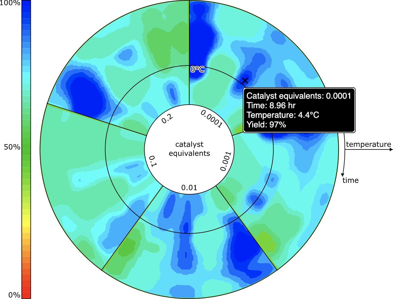
The user interface allows the selection of one specific concentration, which is then plotted as the heat/time 2D grid, in the same way as for reactions without a catalyst.
In terms of validation, this model is not backed up by any kind of lab verification, but spot checking selected reactions generally highlights the correct regions, so it passes the smell test. Whether it reveals other viable reaction conditions (e.g. maybe a reaction could be done at lower temperature or with less catalyst) remains to be seen. My instinct is that it is capable of providing decent Initial indications, and is useful when there is no reference starting point. Indications are that this model is particularly data hungry, as opposed to the other ones that operate well at an artisanal scale: so it should improve considerably as content grows.
The next article describes backward/forward synthesis and reagent proposal.
