 The Approved Drugs app is about to get a new update, which introduces a visual clustering feature. Initially, this is a bit of a novelty, but has a clear pathway toward a more sophisticated, high value offering.
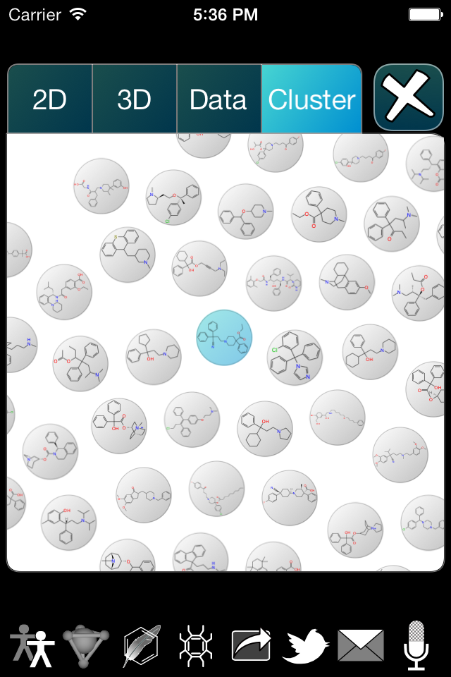
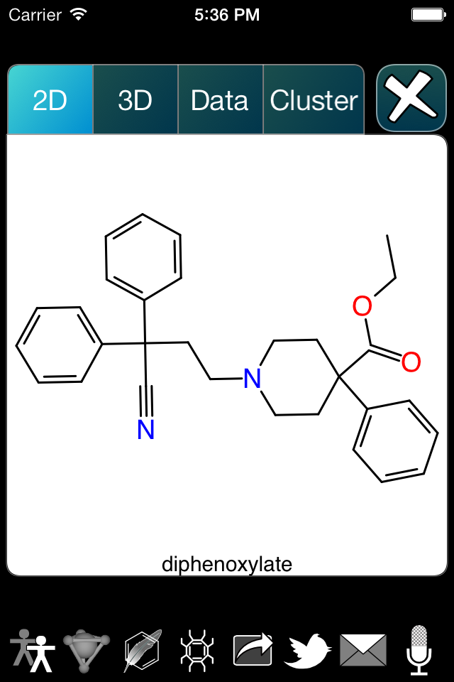
The app itself is based on a simple concept: provide a list of some of the FDA-approved drugs, and display them by structure in a browseable list. The list can be scrolled up and down, and tapping on any of the structures reveals more detail information. As of the newer version, the types of content that can be viewed includes a tab called cluster, which displays the selected drug in the centre, with structurally similar drugs arranged in proximity:

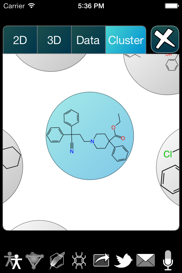
The new cluster display starts by determining similarities (based on a path-length-4 chemical graph fingerprint), and arranging them around the central selected entry. The display is interactive, in that it allows panning & zooming gestures, but will later be extended to allow further functionality, e.g. navigating and viewing other entries, moving items around in the cluster, and dynamic relaxation of the quasi-forcefield like term that is used to position the entries. A later version will also include the ability to specify an arbitrary new structure, and cluster around it, similar to the way the app currently allows a structure to be drawn or pasted in, to sort all of the known FDA-approved drugs by order of similarity.
As well as this new clustering feature, the next version of the Approved Drugs app will be fully migrated to iOS 7. As you may have heard from the significant amount of discussion on the subject, the latest version of iOS is a major overhaul in terms of visual aesthetics, both internally and externally. Most of the apps from Molecular Materials Informatics avoid using the default iOS aesthetic, since it never really fit very well with the design theme, and so the total overhaul of the look’n’feel has had relatively little impact. The big exception, which affects everyone, being the way the new status bar is handled: the status information is drawn over top of the widgets used by the app. This is a definite improvement from an aesthetic standpoint, but it means that every fullscreen view has to be reorganised. For this reason, the menagerie of apps is being carefully ported, on at a time.
