 The molecular drawing capabilities introduced with the Mobile Molecular DataSheet (MMDS) app are still unique in the mobile chemistry space insofar as the user interface allows for precise drawing of manuscript-quality diagrams (i.e. perfect bond lengths and angles), on an incredibly tiny screen (the original iPhone form factor), and also very quickly. This sounds like a violation of basic engineering principles (i.e. fast, cheap, good: pick two), but there is of course a down side: the interface is different from the conventional industry standard paradigm, and takes some getting used to. While the capabilities have been regularly improved over more than 4 years since it was first released, a significant overhaul of the “onboarding” experience is long overdue, starting with more targeted adaptation to multiple screen sizes.
One of the many reasons for procrastination is the promise of a new development language coming out in the near future, but since Swift clearly needs to be put back in the oven to bake awhile longer, it behooves us beleaguered software engineers working on iOS apps to keep our Objective-C libraries clean and uptodate, because it looks like that’ll be sticking around for awhile.
Back in 2010, when I was experimenting with the idea of building an as-good-as-desktop sketcher to run on tiny little underpowered phones, one of the major concerns was being able to get all of the action items crammed into the very limited space. This ran into a major conflict between learnability and productivity: if you put just a limited number of menu items on the front screen, and bury all the rest behind layers of submenus, it can be less daunting to a new user, but navigating forward and backward between menu layers is incredibly annoying and timewasting for the experienced user. While the MMDS sketcher takes every opportunity to figure out what you want from context, the reality is that drawing chemical structures is still a very complex workflow, and there are many, many capabilities that can not be inferred, and really do need to be presented directly to the user, preferably in a place that can be accessed with one tap.
Since then, devices from Apple have gotten a bit bigger, in terms of logical pixels:
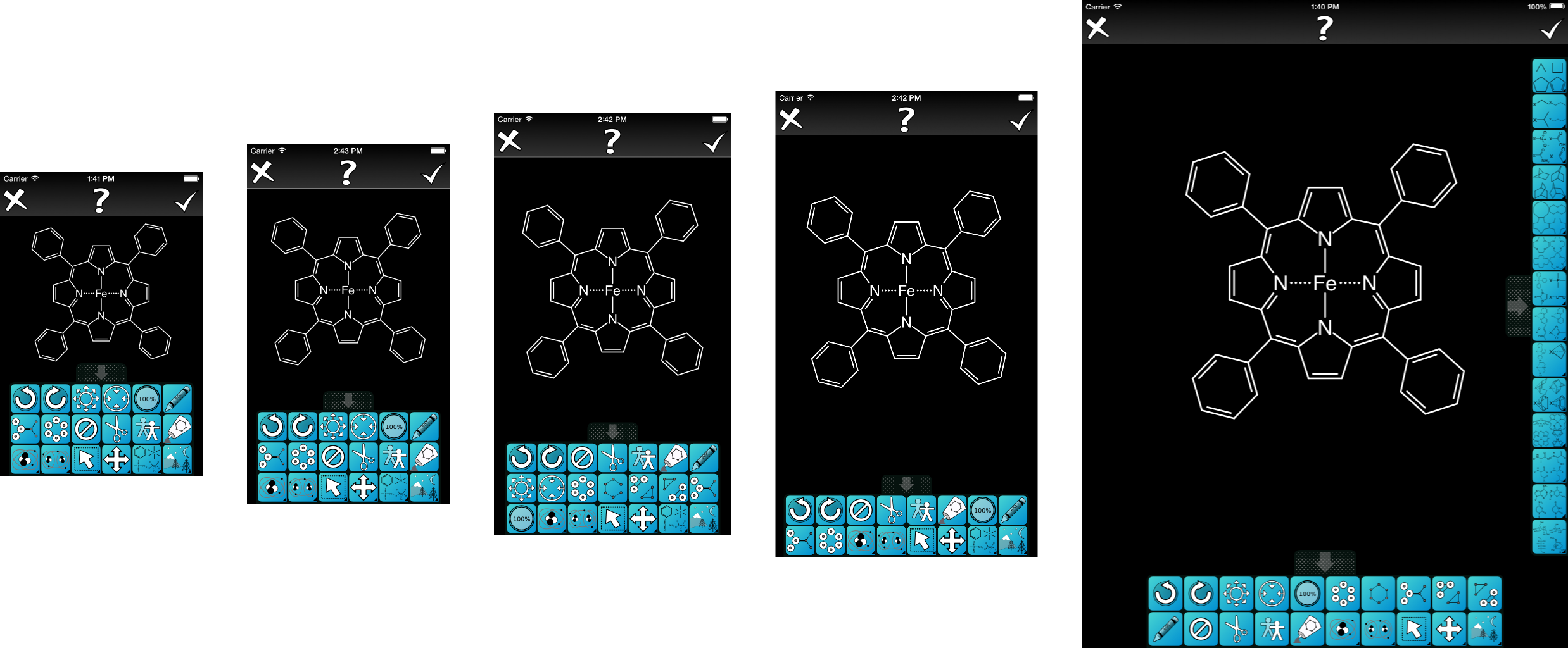
Starting with the original iPhone form on the left, and evolving to the iPhone 5, 6, 6+ and iPad shapes: the amount of pixel space to play with keeps going up, and so the next version of the MMDS app (followed by all the rest of the products from Molecular Materials Informatics that make use of the same capabilities) will adapt accordingly.
The first change is to formalise the idea of having an always-present bar along the top that hosts the reject/accept buttons, i.e. for getting out of the editor. These were originally held in the main command bank along the bottom of the screen, since real estate was so tight, but at this time the only iPhone with the original form factor that can run iOS 8 is the 4S model: the rest of them have been left behind, for better or for worse. The extra height of the iPhone 5 makes the amount of play-space equivalent to the original, less convenient button arrangement.
With the iPhone 6 & 6+ sizes busting the seams of peoples’ pockets, this also provides some more width to play with, which means that some more icons can be crammed in, and/or the number of rows of command buttons can be dropped, to allow even more space for editing the molecular structure. Note that there are a few command action buttons on the main menu that appear & disappear with successive versions of the sketcher: nothing is being gained or lost, these are optional convenience functions, like zoom in/zoom out, which is redundant with the pinch-to-zoom gesture.
Perhaps the most in need of some additional thought is the iPad form factor, which has been around for some time. Since all of the apps based on this technology resize themselves automatically, there hasn’t been the strong incentive to design a completely parallel user experience for phone vs. tablet: the underlying codebase sees more available room, and seeks to use it up in much the same way. One way to productively make use of the greatly improved screen real estate, other than widening the command buttonbank, is to migrate others to the edges. In the current prototype, the template bank has been moved out of the main command bank, and turned into a vertical bank on the right hand side, for the iPad only. With current versions of the sketcher, navigating through the predefined templates is a little more tedious than it needs to be, since the templates are many, which requires levels of sub-banks. This fairly obvious and simple change removes a layer of forward and backward menu navigation, and these kinds of details are important for regular users.
You might have also noticed the “?” icon at the top centre. This is currently just a placeholder, but is to be an entrypoint into much more useful help and tutorial options. Details will have to wait, but that’s the next frontier.
 Cheminformatics 2.0