 The SAR Table app provides some quite sophisticated property analysis features, which are predicted on the assignment of schemes to property-type fields. This allows not only colour-coding of activities, but it also provides the information that algorithms need to transform the property into a normalised, linear space (e.g. log units for activity values given in concentration). The selection of suitable {low, medium, high} values can be used to cap the distribution, stretch parts of it out, and generally fine tune the display, so that active/inactive compounds will jump out of the screen in a manner that is appropriate for delivering the necessary structure-activity insight.
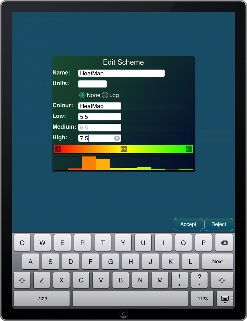
The current version of the SAR Table app has a fairly crude dialog box for editing the scheme parameters, but the next version that will go out on the appstore has a revamp. Most notably, there are graphical distributions that update as the {low, medium, high} values are tweaked: one of them shows a rainbow band for the selection of colours, while the other shows a coarse bar graph that represents that distribution of property values. This can be used as a guide to provide some idea of what ranges are appropriate.
For example, if you were looking at a dataset where all the compounds are quite active, and all of the binding affinities were in the -log10[mol/L] range of 7 through 8, using a default colour scheme that shows everything from 5 through 9 would mean that activities of good vs. better would be difficult to distinguish. By shifting the range, the contrast can be adjusted, which greatly helps for observing trends.
Another nice feature is that the medium value visually defaults to the midpoint between low and high, and is calculated in transformed space (e.g. if low = 107 nM and high = 1 nM, then the default medium value is 104 nM).
