 One of the projects that has been keeping me busy lately is a structure data-mining exercise intended to reveal some interesting scaffold hypotheses that can contribute to research into finding new cures for tuberculosis. The process is at an early stage, but if you’re interested in taking a look at some of the preliminary results, you can view them here.
The results of this workflow will involve a lot of mobile apps and cloud computing in the later phases, but at the moment the main actions involve working through some of the hardcore cheminformatics algorithms that are baked into the serverside software operated by Molecular Materials Informatics, much of which has not yet been made available for production use.
 This story begins with TB Mobile, which is a free mobile app (iOS & Android) built by yours truly, coordinated by Sean Ekins, and produced by Collaborative Drug Discovery. The source materials for the app consist of about 700 structures curated from throughout the literature, each with information about the target that the molecule hits in order to kill off the disease cell. Since these are known actives with additional information about what they’re actually active against, the rationale is that looking for particular structure patterns (in this case, scaffolds) derived from this collection, and comparing these to a breakdown from a larger collection of data that is known to be simply active or inactive against the disease cell overall, can provide more focused insight than either of the separate datasets.
In order to get from here to there, a significant amount of processing is required. The core cheminformatics libraries (com.mmi) were already in good shape to handle most of it, but a few glue-scripts were required, as well as new features and the usual frequent bug fixes that are part of applying brand new software for the first major use case.
Step 1: rearrange the TB Mobile data, removing most of the information and boiling it down to denormalised 2-column datasheet providing just molecular structure and target code.
Step 2: assemble the bulk structure-activity data, provided by Sean Ekins, consisting of a little over 7000 structures with active/inactive status. Being a routine task, this was a good opportunity to field test an early prototype of the workflow-framework, a component of the com.mmi cheminformatics libraries that allows pipeline-style operations to be strung together and executed as a concurrent stream. The product currently has no user interface, so it’s only useful to experts who are comfortable with a text editor, but that could be addressed later on.
Step 3: go through each of the structures from TB Mobile and fragment them into multiple scaffold-like substructures (similar to the Schuffenhauer & Ertl method, except exhaustive rather than linear). Merge degenerate structures (and collapse their target codes). Keep just those with at least 10 heavy atoms, no more than 4 graph isomorphisms (i.e. avoid really high symmetry), and eliminate those with a macrocyclic ring. This sequence is also done with the workflow pipelining framework, using the exercise as motivation for creating new general purpose operation types.
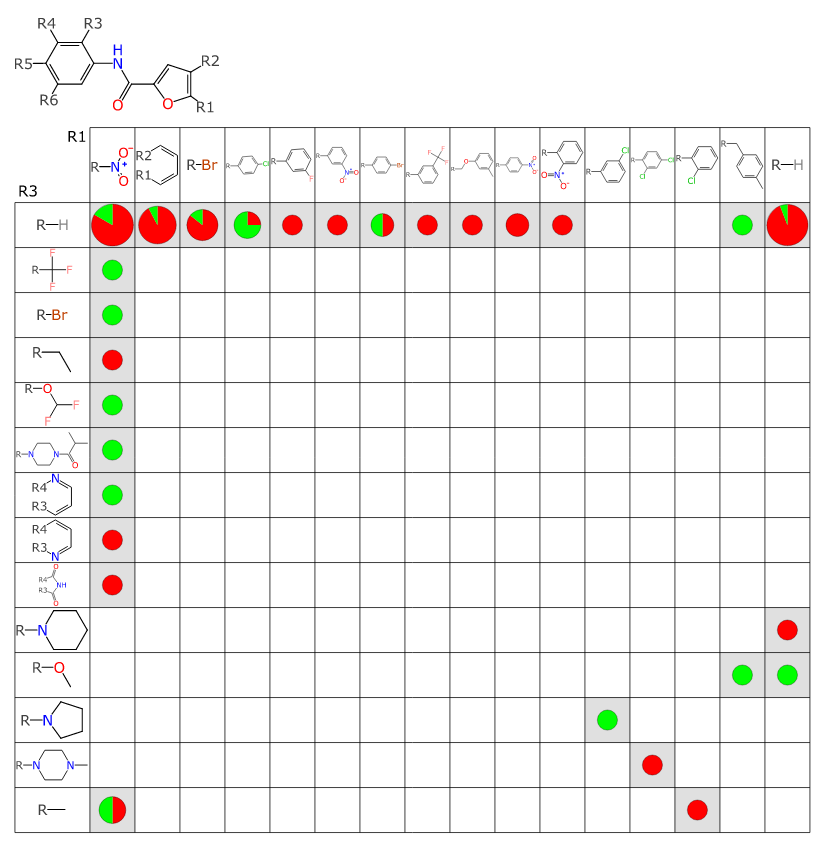
Step 4: for each of the resulting fragments, perform a scaffold analysis against the larger collection of 7000 structures (with active/inactive, but lacking target information). The scaffold analysis uses an algorithm that has the same core as that used by the SAR Table app, except that this variant (which has been gathering dust for awhile) is designed to operate on relatively large datasets, without human intervention. The algorithm can propose new R-group placeholder labels (since the incoming fragments do not have these) and make judgement calls as to resolution of symmetry (which is an intractible algorithm that scales exponentially when treated naively). The results are filtered, such that the resulting number of matches must include a fair number of actives an inactives. Each of these results is a SAR Table document, so it can be readily loaded into the app and visualised.
Step 5: even though the SAR Table app has all the necessary visualisation capabilities, it is optimised more for working with one dataset at a time, rather than high throughput eyeballing of a large set of auto-generated content. So a serverside analysis and plotting routine was created: for each output table, all of the Rx vs Ry substituent placeholders are plotted against each other.
 The output you can see online, starting here: if you open the link, you can see R1 vs R2 for the first proposed scaffold, and you can click on previous/next to step through all of the output tables/combinations that were deemed worthy of passing along to a human for momentary examination. This is the high watermark for this exploratory project thus far.
Which leads to some thoughts about what a scaffold actually is, when it comes to a drug discovery campaign. Sometimes called “Markush structures”, they have found a lot of utility for rationalising structure-activity relationships. The choice of scaffold is motivated by a variety of circumstantial factors: synthetic route (if you’re a real chemist), structural alignment overlap (if you’re a computational chemist) or patent protection (if you’re a lawyer). I would be inclined to describe the scaffold selection criteria using nebulous terms: a good scaffold (or group of scaffolds) is a structural core that provides an anchor, such that tweaking the R-group substituents increases or decreases the activity in a way that follows a logical structure-activity pattern.
For example, if for a given scaffold, all instances where R1 is an aryl group have low activity, but all instances where it is a halide have average or better activity, that would qualify as a highly desirable property of the scaffold.
There are also the distribution properties when it comes to plotting all of the R-groups against each other on a matrix. These kinds of plots are not all created equal, and some are a lot more useful than others, e.g.:
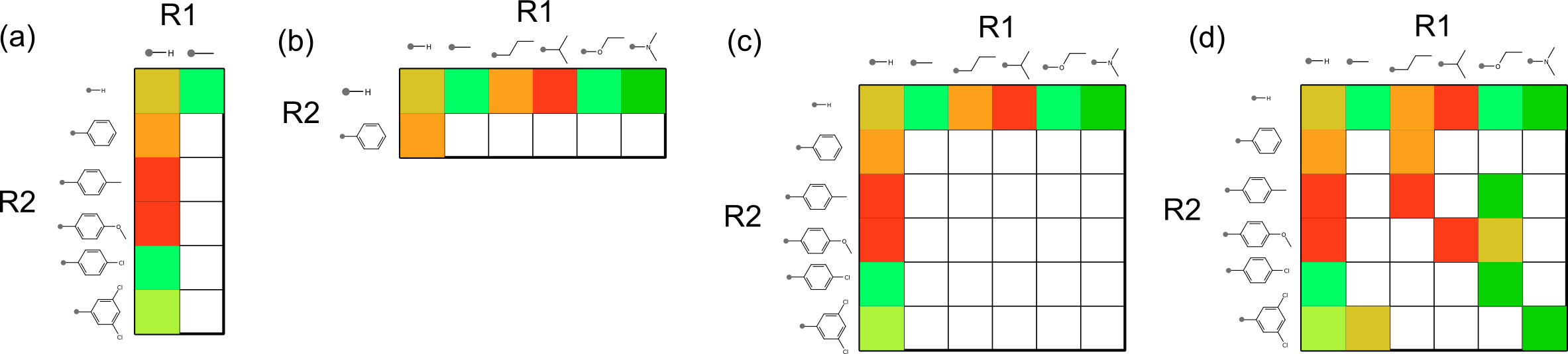
Unfortunately the most commonly observed patterns are the one stripe [shown in (a) and (b)] and two stripes [shown in (c)]. The single stripe patterns are seen when the other substituent has incredibly low diversity, and the two stripe pattern often shows up when two substituents are essentially orthogonal to each other, and is often observed when the opposing substituent is hydrogen. For the most part these stripe patterns tend not to provide a great deal of information for correlating structure-activity information (though you might be lucky, if the effects of the substituents really are orthogonal when it comes to binding affinity). The most useful kinds of matrix plots are those exemplified by case (d), where the grid population looks a little bit more like a half-finished game of chess.
Part of the purpose of this overall exercise is to come up with some useful metrics for an algorithm to examine a structure-activity matrix plot of this kind, and score the best ones for presentation to a discerning human. I have some preliminary metrics, but it’s hard to tell how good they are without a convenient way to view the corresponding data, with a turnaround time that’s appropriate for an impatient programmer.
Hence the bulk output, designed for quick click-through.
