 Further to yesterday’s post about making model resources for COVID-19 available online, the resource page now shows the reaction transforms used to propose potential new candidates, as well as atom highlighting for applied Bayesian models.
Yesterday’s description of recent activities in the cheminformatics man-cave described the markup of fragment-like molecules bound to an important COVID-19 protein to build Bayesian structure-activity model. At the end I mentioned that the last section’s enumeration of proposed & scored molecules had a back-story of its own. So here it is.
The basic idea is to create an enumerator of chemical space that draws from common simple high-yield chemical reactions performed with commercially available building blocks. As a proof of concept, I dusted off the part of my brain that used to know about synthetic chemistry, and pulled together several common reactions, expressed as their generic transforms (lacking anything so mundane as conditions or reagents):

In case you’re wondering, the software used to create and view these reactions is called Molecular Notebook, and is Mac-only, although there is a perennially half-finished cross platform version in the works.
Armed with these generic baseline transforms, the next step is to combine them with a catalog of structures which are known to be purchasable. There are quite a few companies that can hook you up with such a catalog, and I chose to use the building blocks collection from Mcule, which they make easily accessible.
These fragments were fed into the grinder and applied to a match for each of the generic transforms shown above. Each molecule (over 3 million) is tested to see if it has exactly one match to any of the generic transforms and, if so, a somewhat less generic transform is created and emitted. This is easier to see visually:
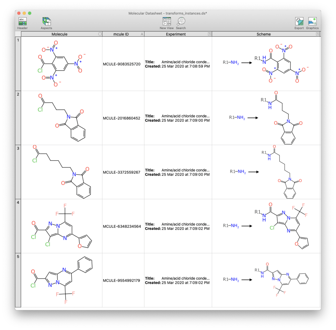
In these initial examples, all five of the reactants happen to have 1 acid chloride functional group, and as such these are considered to be suitable for a condensation reaction with an amine, to form an amide.
The algorithms for detecting reaction matches and upgrading reagents into generic structures with good aesthetics (such as coordinate alignment) is a long story, which I won’t go into – except to say that manipulating reactions is especially prone to edge cases, even more so than most other corners of the cheminformatics algorithm universe, and this caused more than a few late nights.
Each generic reaction is limited to a total of 10,000 instances, and when more than that are possible, a diversity cluster is instituted to keep the total number within reason (since some of the functional groups are rather common).
At this point in the workflow, we about have 3 million possible starting materials, and tens of thousands of possible things we can do with each of them. It’s hard to visualise how much of chemical space is covered by possible combinations, but since the building blocks themselves are quite diverse, it is reasonable to expect that we could cover a respectable landscape of druglikeness.
The next step is to string together a random enumerator, using the proprietary workflow pipelining framework developed under the banner of Molecular Materials Informatics. The basic idea is to start with a node that reads all of the starting materials, and passes them to the first enumeration step. The first enumeration step loads up tens of thousands of transformations (as described previously) and randomly selects them to see if they can be applied to the input molecule. Once it has found a certain number of hits/misses, it moves onto the next compound. There are four of these enumeration steps applied sequentially. Each of the intermediate enumeration steps sends its output to the next enumerator and to the final collection node, so outputs can have between 2 and 5 building blocks strung together.
This is one of the few tools that I can’t easily make a pretty diagram for, since it doesn’t actually have a dedicated user interface. So I’ll just ask you use your imagination and conceptualise this as if it were being in a more familiar tool like KNIME or Pipeline Pilot.
The collection node aggregates everything from the output streams, and invokes the Bayesian model (described in the previous article) as a scoring function, i.e. estimated affinity for the Mpro target protein of COVID-19. There are thousands of candidate molecules streaming into the scoring node each second, and these are passed along to a ranking node, which keeps just the top 1000 candidates. Once the whole process is exhausted, this collection of best candidates is run through the depiction algorithm (if necessary), and the results are saved to a collection.
This is the downloadable file fragments.ds that is referenced at the top of the page. There is an SDfile version as well, but it lacks some of the additional metadata – most importantly, the reaction assembly sequence.
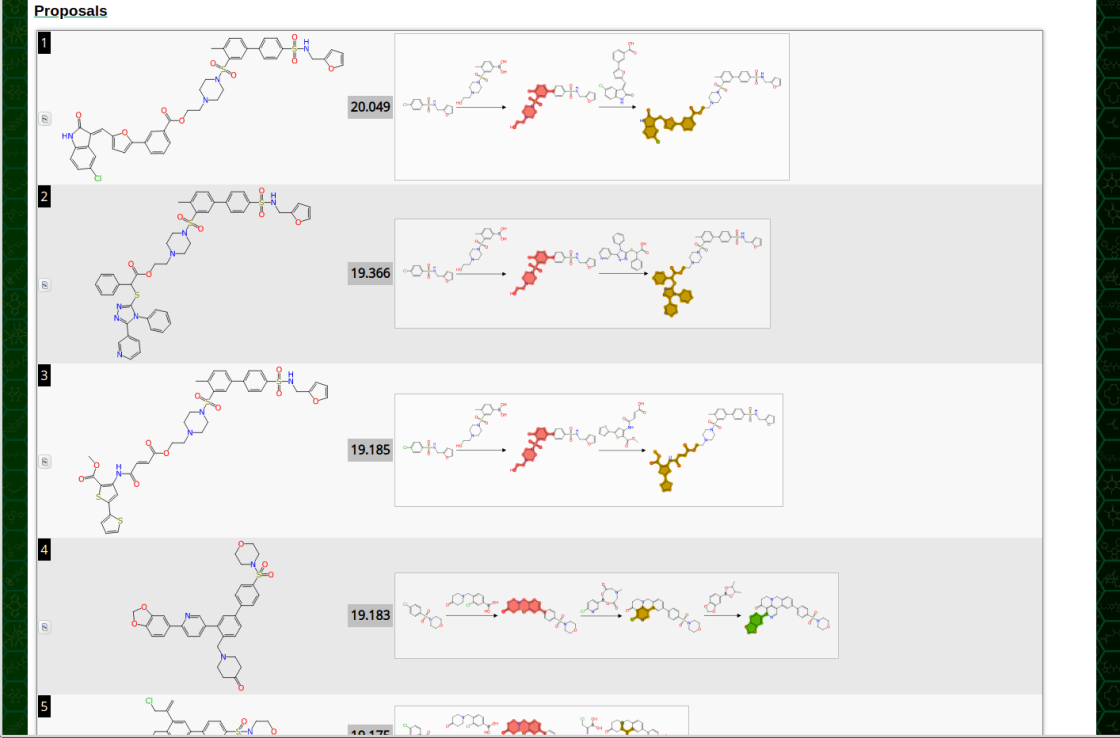
On the latest version of the page, the structure + score is now supplemented by a miniature scheme diagram that shows each of the fragment attachment reactions. The summary form is a little hard on the eyes, but clicking on it brings up a zoomed version:
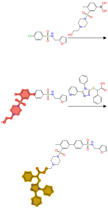
From the visual clues provided by the highlighting, and the orientation of reagents to overlay onto their position in the product, it should be fairly clear to a synthetic chemist what is going on at each step.
This is basically a proof of concept for a mass-scale plausible product candidate generator, winnowed and selected based on performance with an existing structure-activity model. If any of the high scoring candidates actually look like something that might be worth trying out in the laboratory, most of them should be quite easy to prepare. There are caveats, of course: the level of detail in the matching criteria is relatively simplistic in this early incarnation, so if you look carefully, you’ll find a few that would be unlikely to work for one reason or another. Also, for aesthetic purposes, each reagent should be partially re-depicted as it is grafted onto the main molecule, rather than just lined up with a superimpose operation. Such niceties are on the to-do list.
The other major feature is atom colour-coding based on Bayesian model predictions, which provide a visual indicator of which atoms are in a functional group area that is considered good, bad or indifferent:
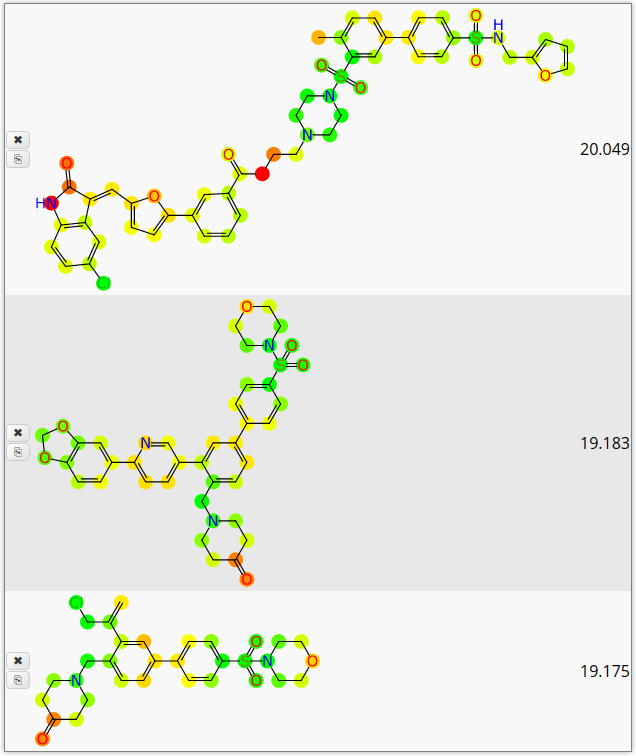
The common traffic-light scheme is used, i.e. green for atoms favourable for biological effect, red for bad, and yellow for meh.
This particular display style is something that I have included in a number of apps in the past, but this time there is a key difference in the underlying algorithm. Atom highlighting is possible because each of the circular fingerprints that goes into the Bayesian model is based on 1-or-more atoms, so it is possible to track the contributions back to their original source. So instead of adding the contribution of each fingerprint to the total molecular score, it can be divvied up amongst each of the atoms that gave rise to the fingerprint.
That part is simple, but the problem is calibration. The Laplacian-correction to the naïve Bayesian method is necessary to deal with the huge number of priors, but as a side-effect it means that the output is an arbitrary unscaled number, rather than a nice tidy probability. I generally use an algorithm that analyses the ROC curve to find a transform to cap most of the outputs into a probability-like range, which works quite well when numbers need to be more directly interpretable. Doing this for individual atom contributions requires a bit more creativity. The idea of how well a model applies to atoms rather than molecules is allowed to be partially subjective (or so I would argue), but it should at least be consistently interpretable.
The calibration method that I came up with last night can be described as plotting the calibrated molecular prediction vs. uncalibrated atomic contributions (e.g. if the probability-like estimate of whether a molecular is active is calculated to be 0.8, each of the atomic predictions is plotted as [x, y] = [atomic, 0.8]). These points are collected for all of the atoms & molecules in the training set, and a line of best fit is determined via least squares. Unlike most use cases for fitting a line to a scatter plot, the errors are actually the signal: this is a perverse use of statistical methods, but it suits the purpose. The line fit equation of y = ax + b is further calibrated for the whole dataset such that the mean average absolute deviation is halfway to either extreme.
The bottom line is that when these atomic predictions are calibrated thus, and turned into coloured blobs, it is very easy to visualise the good and bad parts of the molecule, based on the structure-activity information that is encoded in the Bayesian model.
If any of this sounds interesting feel free to get in touch. I’m definitely interested in any new datasets as they become available, and ways to pitch in to help make this horrible virus go away. My prediction is that the amount of structure-activity information for COVID-19 is going to become abundant very soon, and we should start putting it to work as quickly as possible.
