 Since the BioAssay Express project added molecules to supplement the annotated assays, we have been able to explore various interesting visualisation techniques. One of the obvious options is to plot a table with assays on one axis and compounds on the other, and look for insights regarding which molecules light up the various different screens.
Our initial explorations into making a user interface for plotting assays vs. compounds were based around the “Probes Report” idea, which is currently demonstrated as a canned page (see here). The wrapper takes a list of NIH probes (which we had to compile manually: Ekins & Lipinski 2015) and up the corresponding assays from the BioAssay Express collection, some of which fall into the set of 3500 that we have curated thus far:
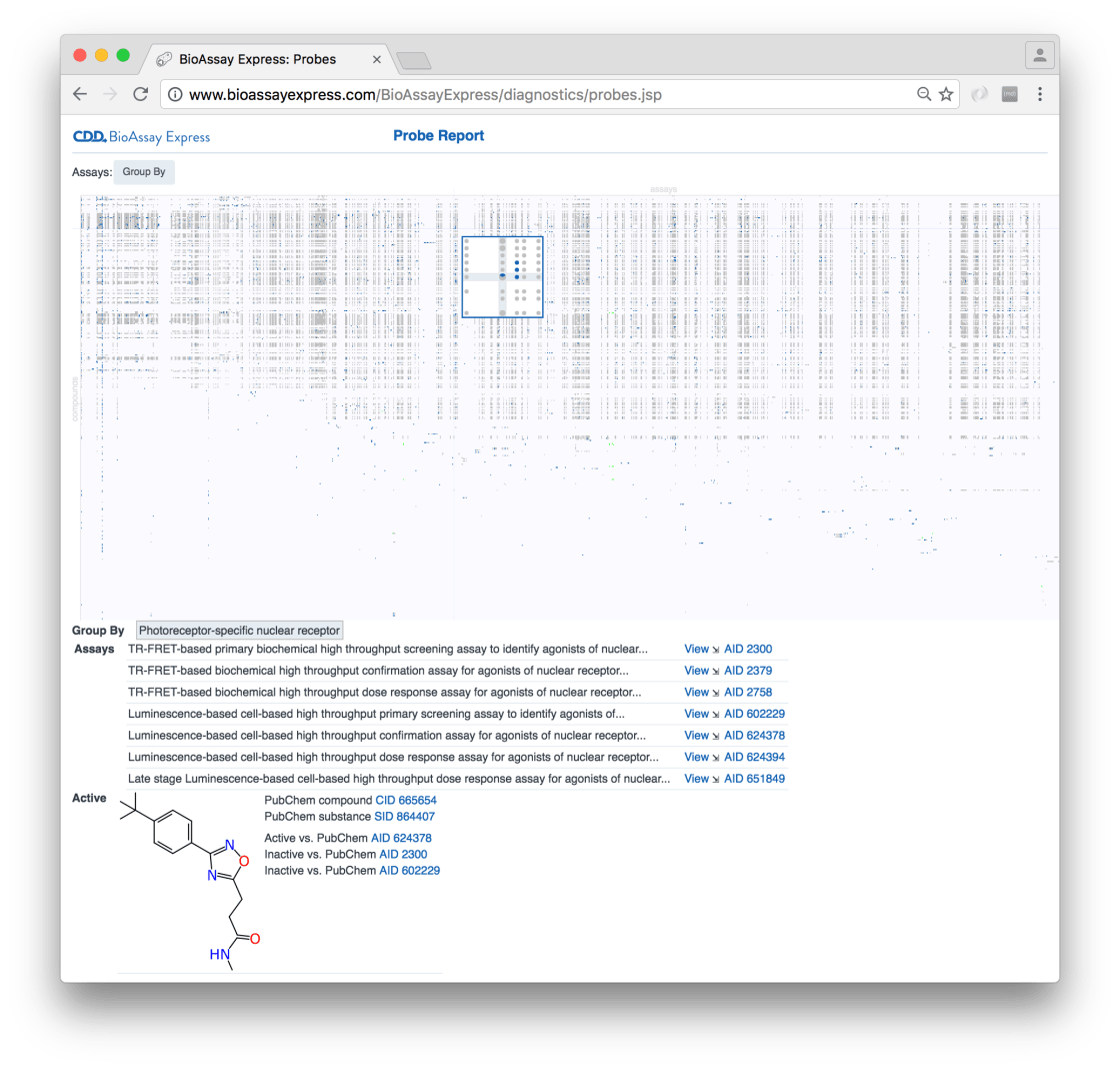
We will have plenty more to say about this analysis of probes at a later date, but for now I want to back up a little bit and describe recent additions that make it possible to select the assays & compounds prior to plotting them all on a table.
There are two ways to easily pull out lists of assays from the curated set: Browse and Search (described to some extent previously). Browsing is more effective if you want to start with general ideas about which assays you want to look at and become progressively more specific. For example, starting with assays that pertain to tuberculosis:
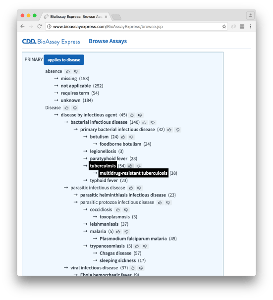
… and subsequently narrowing down the selection to remove primary screens (i.e. take out the high throughput experiments with hundreds of thousands of noisy datapoints):
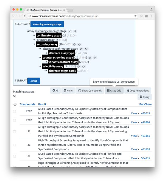
The button that has been added most recently is Assay Grid. Clicking on this brings up a new tab which provides the tools necessary to start with this selection of assays and go find the corresponding compounds. Note also that the list itself shows the number of compounds that are associated with each assay, and they can be selected manually using the checkbox (by default, though, the whole lot will be used):
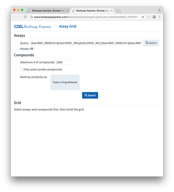
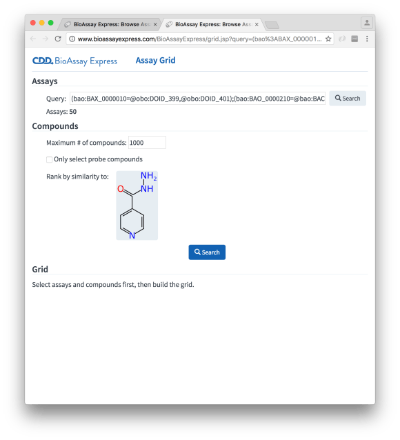
The Assay Grid page starts out looking relatively bare. There are three sections: the first one, Assays, is prepopulated with a query (which is equivalent to what was configured on the Browse page), which in this case corresponds to 50 assays (secondary screens against tuberculosis).
The Compounds selection is requesting some constraints for pulling out compounds that correspond to these assays. One option is to just grab everything, but this can get overwhelming, especially when there are primary screens involved, and so there is a maximum cutoff. Without any further information, the list of compounds will be first in, first served; however, we can specify a reference molecule, by pasting or dragging a molfile into the appropriate widget, e.g. isoniazid:
Hitting the Search button starts going through all the compounds belonging to the selected assays, and ranking them by similarity (ECFP6/Tanimoto):
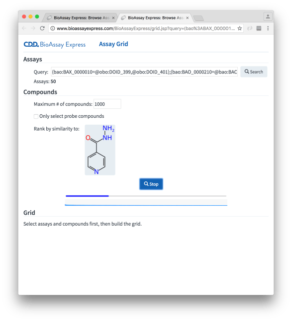
Obtaining the compounds is fairly quick in this case because these are secondary screens with relatively few measurements per experiment, but if there are primary screens in the mix, it can take a while to chew through them all. Underneath the progress bar is a visual indicator of how similar the current set of results are to the reference molecule, which updates dynamically with each batch (in keeping with core user interface principles: anything that is slow and boring should provide a regularly updated animation of some sort, which makes the downtime seem much less than it is).
Once the compounds are selected, the grid can be built:
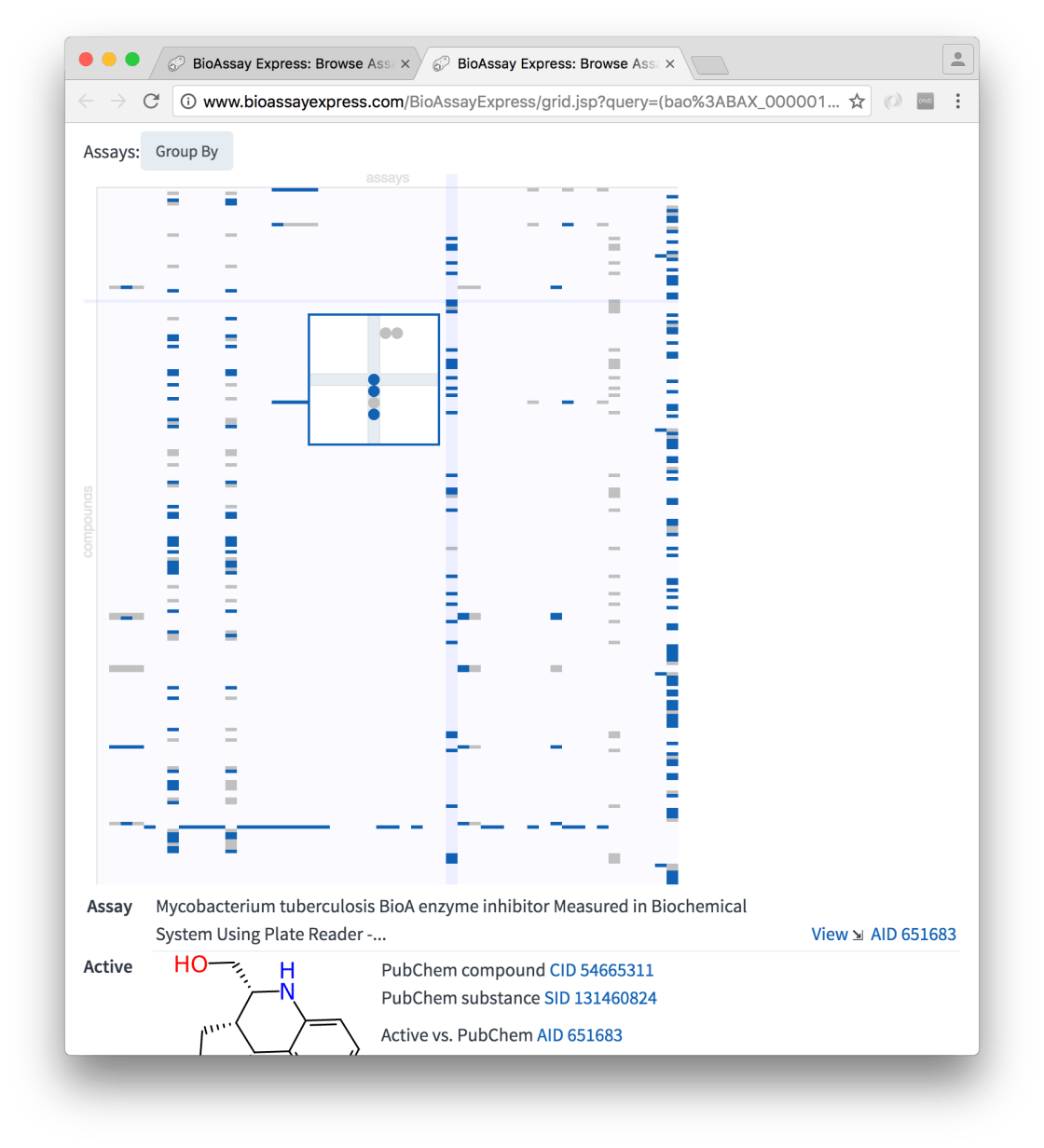
At a first glance, it can be seen that assays are plotted in columns and compounds in rows. Cells that are shaded in light grey are inactives and those in deep blue are actives. Because the molecules were selected using a similarity search, those nearest the top are most similar to isoniazid.
Moving the mouse over any section of the grid brings up a detail popup. The necessity for the zoom-in is not quite so apparent in this particular example, but when there is a lot of content, the dots can get really small.
Whenever the selected cell includes at least one measured molecule, the details are shown underneath the grid: specifics about the assay (and links to view more), as well as the molecular structure, and its origins in PubChem, are shown.
At the moment this particular grid widget has only fairly basic functionality for viewing and perusing. There is presently just one control method for rearranging presentation, which allows assays to be grouped according to specific features, which is helpful when there are a lot of assays (e.g. grouping by target is a good way to reduce the number of columns to fit the screen size more comfortably). More kinds of controls are planned, including sorting methods, and for the molecules: clustering by structural similarity, which will be particularly useful when retrieving thousands of molecules, but still needing to view the structure-activity patterns onscreen.
This feature is fully operational right now: the BioAssay Express page is live, and you can either follow similar steps to those described above, or just click on the Probes link. As with everything else in this public-facing service, it is evolving fast.
